Turkish Home Decor Without the Souvenir-Shop Look

There is a version of Turkish home decor that works beautifully in a Western house, and a version that makes the room look like the lobby of a themed restaurant. The difference is not budget or authenticity. It is restraint, and specifically it is knowing that these objects were designed to sit among plain things rather than among each other.
This is a guide to getting the first version. It is opinionated in places and I have flagged where.
The rule that makes Turkish home decor work
One loud object per sightline.
A kilim, a hand-painted ceramic, a pierced lamp, a copper tray, a mother-of-pearl inlaid box: each of these is a finished composition on its own. They were made to be looked at. Put four of them within a metre of each other and none of them gets looked at, because the eye has nowhere to rest.
In a Turkish home this is obvious in practice: the rug is on a plain floor, the lamp sits against a plain wall, the ceramics are on an open shelf with space around them. The plainness is doing as much work as the pattern. Western interpretations tend to import the objects and skip the plainness, and that is where the themed-restaurant effect comes from.
My opinion, stated as one: if you own five Turkish pieces, put three of them in different rooms. The scheme will read as considered rather than as a collection.
The material palette worth knowing
Five materials do most of the work, and they combine well because they share a warm undertone.
- Wool. Kilims (flat-woven, no pile) and knotted rugs. Kilims are cheaper, thinner, work under furniture, and layer over a larger plain rug well.
- Copper and brass. Trays, coffee pots, bowls. Unlacquered metal develops a patina and that is the point. Do not polish it back to a mirror unless you want it to look new, which is not the aesthetic.
- Glazed ceramic. İznik-style blue and white, or the softer Kütahya palettes. High contrast, so one piece goes a long way.
- Cotton and linen. Peştemal towels and throws. The most useful category, because they are functional and they carry the palette without adding another object to look at.
- Carved and pierced organic material. Wood, and dried gourd shells. These read as texture rather than as pattern, which is why they combine easily with the others.
What ties them together is that none of them is cold. If you are working from a very cool grey-and-chrome starting point, expect to change the wall colour or the flooring before any of this settles in.
Room by room
| Room | The one piece to start with | What to avoid |
|---|---|---|
| Living room | A kilim, layered over a plain jute or wool rug | Kilim plus patterned cushions plus patterned throw |
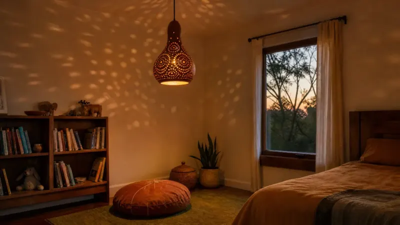
| Bedroom | A pierced lamp on one side of the bed | A matching pair plus a patterned bedspread |
| Hallway | A pierced or mosaic lamp on a plain console | A gallery wall behind it |
| Kitchen | Peştemal tea towels and a copper pot | Tiled splashback in İznik pattern — very hard to live with |
| Bathroom | Peştemal towels, a hammam bowl | Any organic or unlacquered piece — steam ruins both |
| Dining | A copper tray as a centrepiece, or a pierced pendant above | Both at once |
The bathroom row is worth expanding, because it is the mistake I see most often. Peştemal towels are perfect there, since they were designed for a hammam. Copper without lacquer will spot, and anything organic, including a carved gourd shade, absorbs the steam and slowly degrades. Textiles yes, objects no.
Light is the part people skip
You can get the rug, the ceramics and the copper right and still have a room that feels wrong at night, because the light is coming from a single fitting in the middle of the ceiling at 4000K.
The fix is not complicated. Two or three low warm sources at different heights, all at 2700K, and a switch arrangement that lets you turn the overhead off entirely. A table lamp, something at floor or low-shelf level, and one hanging piece will do more for the atmosphere than another textile will.
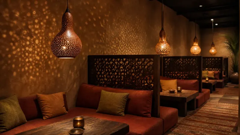
Pierced lighting earns its place here specifically. A carved shade adds pattern to the room without adding another patterned surface, because the pattern appears on the walls only after dark and vanishes during the day. That is a genuinely useful property in a small room where you cannot afford another busy object. The hanging lamp guide covers the ceiling side of this and the Turkish lamps buyer’s guide covers the styles.
Where to buy each category
- Rugs. Specialist dealers, or in person if you are in Turkey. This is the category where expertise pays for itself, and where the gap between a good and a bad purchase is largest. Ask about the dye, natural or chemical, and about age.
- Textiles. Low risk. Buy online from anywhere reputable. Cotton peştemal is cheap enough that a mistake costs nothing.
- Ceramics. Check whether the piece is hand-painted or transfer-printed. Hand-painted brushwork varies slightly between repeats of the same motif; transfer print does not.
- Copper. Weight is the tell. Hand-hammered copper is heavy and shows tool marks. Spun-thin decorative copper is light and uniform.
- Lighting. Buy from a maker rather than a marketplace, and check electrical specification for your country before ordering.
Across all of these, the general test for telling a workshop from a dropshipper is the same: reverse image search the main photo, and ask whether the item you receive will be the exact one pictured. That test is covered at length in the piece on telling handmade from factory-made.
Three mistakes worth naming
Buying a matched set. Turkish interiors accumulate. A coordinated five-piece bundle from one seller looks like a bundle from one seller. Buy pieces separately, over time, and let them be slightly mismatched.
Treating it as a colour scheme. Turquoise and terracotta everywhere is a palette, not a style. The style is mostly about material and craft, and it works in a mainly neutral room.
Skipping the plain surfaces. Covered above, and it is the one that matters most. Every one of these objects needs a plain thing next to it to work against.
Kilims, and why this is the purchase to slow down on
A rug is the largest single decision in this style, the most expensive mistake available, and the one category where a few hours of reading genuinely changes what you end up with.
Three things to establish before buying. Whether the dyes are natural or synthetic, since natural dyes age into a softer palette and synthetics tend to hold their colour and then go flat. Whether the piece is old, new, or new-made-to-look-old, all three of which are legitimate at the right price. And the actual condition of the edges and ends, since a kilim with failing selvedges will unravel and repairs are not cheap.
Buy the size up if you are between two. The most common rug mistake in any style is a rug too small for the furniture group, which makes the whole arrangement look like it is floating. In a living room, aim for the front legs of every seat to sit on the rug.
Layering over plain jute or seagrass is the trick that makes a smaller or more fragile kilim work in a big room, and it also protects the kilim from wear. It costs less than buying a large kilim and it looks better than a small one adrift on bare floor.
If you are buying online rather than in person, ask for photographs of the back and of both ends. The back tells you about the weave and any repairs, and the ends tell you about condition. A seller who will not send them is telling you something.
Build it over a year, not over a weekend
The single most common failure in this style is buying everything at once, and it is worth understanding why the result looks wrong even when every individual object is good.
Rooms that read as collected have things in them from different moments, at different price points, in slightly clashing tones. That inconsistency is what makes the room look like it belongs to a person. A coordinated order placed on one afternoon produces a room that looks like a catalogue page, because that is functionally what it is.
A workable sequence: start with the rug, because everything else responds to it. Live with just that for a few weeks. Then fix the lighting, since a room with the right rug and the wrong light still feels wrong after dark. Then add textiles, which are cheap and reversible. Then, last, one or two objects: a copper tray, a ceramic, a lamp with real presence.
That order also protects you financially. The rug and the lighting are the expensive decisions and the ones that change the room most. Objects are the cheap layer and the one where taste changes fastest, so buying them last means buying them with better information.
My opinion, flagged as one: a room with three well-chosen Turkish pieces and a lot of plain surface beats a room with fifteen, every time, and it costs a fraction as much.
There is a budget version of this that works well and gets recommended too rarely. Buy the textiles new and cheap, buy one good object second-hand, and spend the rest of the money on paint. A warm off-white on the walls does more for this style than any single purchase under a few hundred pounds, and it makes everything you add afterwards look better than it is.
If you are starting from a rental with magnolia walls you cannot repaint, the equivalent move is lighting: warm bulbs everywhere, one lamp at low level, and the overhead switched off after dark.
Common questions about Turkish home decor
How do I add Turkish decor without it looking themed?
Keep to one visually loud object per sightline and leave the surfaces around it plain. Spread pieces across different rooms rather than clustering them, and let textiles carry the palette while a single object carries the pattern.
Does Turkish decor work in a modern minimalist home?
It works well, because a minimalist room supplies exactly the plain backdrop these pieces need. The adjustment usually required is warmth, because very cool greys and chrome fight the warm undertone in wool, copper and glazed ceramic, so a warmer wall colour or a wood floor helps.
What is the easiest Turkish piece to start with?
Cotton peştemal towels or throws. They are inexpensive, genuinely useful, carry the palette into a room, and add no visual weight. A kilim is the next step up and the piece that changes a room most.
Which Turkish pieces should not go in a bathroom?
Anything organic or unlacquered. Carved wood and dried gourd shades absorb steam and degrade, and unlacquered copper spots. Cotton peştemal towels and a glazed ceramic or metal hammam bowl are the pieces that belong there.
How can I tell a hand-painted ceramic from a printed one?
Look at a motif that repeats around the piece. Hand-painted brushwork varies slightly between repeats: a line thicker here, a petal shorter there. A transfer print repeats identically every time, and the edges of the colour sit unnaturally crisp against the glaze.
If lighting is the piece you are missing, the carved gourd table lamps and gourd chandeliers and pendant lights here are made one shell at a time and ship worldwide with shipping included.